During OCA Days 2023 the new OCA Logo was shared with the participants. So far we have had a very positive response.
Back in June this year, we reached a turning point with the designer we had started the project with, we needed to start down a new pathway. A number of designers within the open source world were contacted to help collaborate on the next stage of the assignment. Kapreon was selected to move forward with.
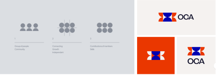
Kapreon presented us with three different options:
OPTION ONE:
OPTION TWO:

OPTION THREE - THE FINAL SELECTION
After a few very well received tweaks the final design was decided upon.
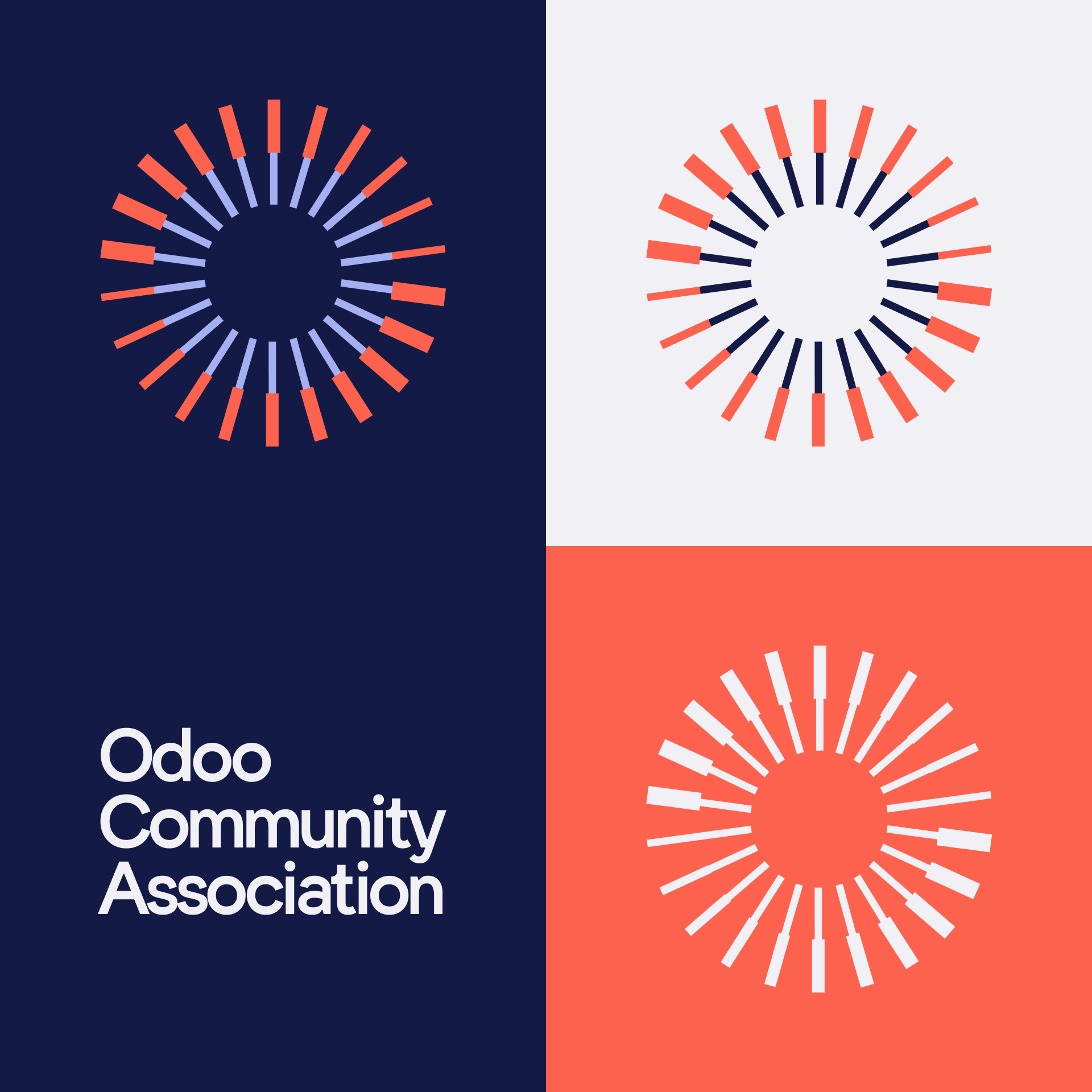

The various elements arranged around the central core illustrate the members who contribute within the OCA. The variation in thickness of these elements symbolizes the independence and uniqueness of each member, highlighting the richness that stems from their distinct contributions and thus underlining the flourishing diversity within the OCA community. In converging towards the center, these elements evoke unity and collaboration, bearing witness to a shared aspiration to achieve a common goal: Making Odoo mightier, together.

Kapreon made the whole process extremely smooth. We were under a very tight deadline by the time we started with them - we wanted to be able to share the new logo at the OCA Days but, we also wanted to be able to use the new logo as part of the OCA Days.
Kapreon shared an extremely well laid-out plan and committed to keeping us on track and fulfilling their creative work within a short space of time. Their suggestions and and ideas were always well thought out and we very much appreciate their efforts.
We had to work across numerous timezones to complete the work (as with all things OCA, we are truly global and the workgroup was certainly spread out across the globe). The team at Kapreon were extremely responsive and understanding of this. Based in Europe and Canada they were able to accommodate this with ease.
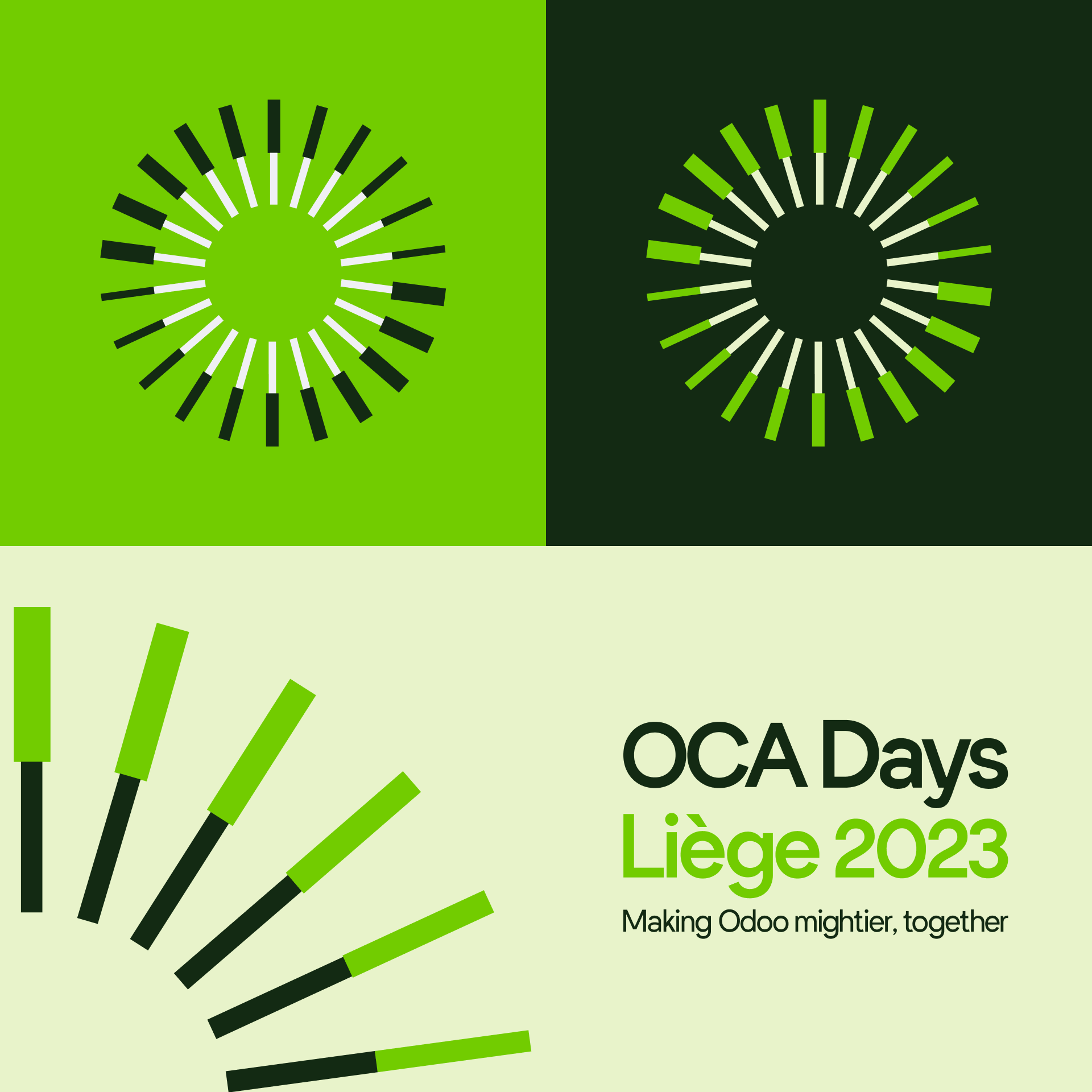
We also now have an official OCA Days Logo for future use - the plan is to have a unique colour for each event going forward based on this initial design.

Keep your eyes open for more changes to the branding as we slowly start implementing it. We'll continue to update the marketing and resources page as we move along as well.
A huge thank you to the Kapreon team for their work and the Logo Workgroup - Julien Jezequel, Kevin Roche, Thibault Rey, Virginie Dewulf and Rebecca Gellatly. Many hours and crazily timed meetings helped to pull this project together.
You can find out more about Kapreon here: